Measure Conversion Rate of On-Boarding Flow in Android

Join the newsletter
Follow my raw solo dev journey. Monthly direct to your inbox, no spam.
App Pause didn’t have an on-boarding flow until recently. It took me a while to implement since I wanted to measure conversion rate for it. The purpose of on-boarding is to make things easier for users, and if I don’t measure it, how would I know if on-boarding is actually helping or not?
Well, at least that was the intent. To summarise, I implemented it in the following 4 steps:
- Create an on-boarding flow
- Fire custom events for each step
- Export data from Google Analytics to BigQuery
- Visualise data on Looker Studio.
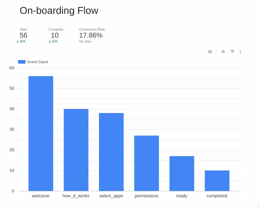
Here is what the data looks on Looker Studio at the moment:
I will now explain each of the step above in more detail.
1. Creating an On-boarding Flow
I wanted to use library to make things easier for me, and while I did find few, they didn’t match my exact vision, so I ended up implementing my own flow. Frankly, it wasn’t that difficult.
On a high level:
- I created a screen on compos and put a HorizontalPager in it.
- Based on the page number, I loaded different composables, where each step is one composable.
- Created next and previous button that updated the page number.
- Added some animation between page switch.
And done. Rest of the logic is embedded in the composable like how you would create normal screens. I used a single ViewModel across all 5 steps.
2. Firing Custom Events from each step
If you are building an Android app, you are most likely using Firebase Google Analytics already. If not, maybe consider it? Firebase, by default, collects some generic events from your app, e.g. screen views.
We just need to use that same framework to fire some custom events. Google analytics has limits to how many custom events you can fire, but the limits are pretty generous (500 per app user).
I decided to create generic custom event called “onboarding” with specialised parameters to differentiate them:
| Param Name | Values |
|---|---|
| action | start, step_viewed, completed, skip |
| step_name | welcome, how_it_works, select_app, permission, ready |
This way, I can cover multiple events (on-boarding start, complete and view of every step in between) with just one custom event. Here is the code snippet for the method I used.
fun fireOnboardingEvent(action: String, stepName: String?) {
    Firebase.analytics.logEvent("onboarding", Bundle().apply {
        putString("action", action)
        stepName?.let { putString("step_name", it) }
    })
}
3. Exporting data from Google Analytics to BigQuery
GA4 showed me count of every “onboarding” event, but what I needed to see was count of the params. To see breakdown of params for a event, you have to first “register” the param on the GA4 dashboard. It felt a lot of work tbh.
Instead, I simply exported all the data to BigQuery where it’s much easier to query such a thing. Exporting was as simple as linking bigquery integration from the admin panel. If you are using Firebase, there should already be a Google Cloud project ready for you to use, so it’s quite simple.
The advantage of BigQuery:
- It’s free to store 10 GB of data each month. For small apps like mine, it’s very unlikely that I will hit such amount of data storage.
- On the stored data, you can run queries. 1 TB of data process is free each month. Again, unlikely that I will hit such a limit.
- For my app with around 100 weekly active users, one of the custom query was taking around 200 KB.
- BigQuery actually provides you estimate of how much data a query might use, so that’s also useful. Always check that before running a query.
- You can configure it such that when limit is hit, the query just fails, rather than incur cost.
- You can delete old data to make space for new ones.
Once you export the data, it takes around 24 hours to see the first table. Each day’s data is stored in a table named event_YYMMDD.
4. Visualization on Looker Studio
Once the table was created after 24 hours, I was able to then connect BigQuery with Looker Studio, which is free to use. Here is what I created for the on-boarding event flow.
To create this, just do the following:
- Insert a table
- Filter events based on name “onboarding”
- Add dimension: “Event Param Name Value” so that a column gets created for each value of the event
- What should be the value for each row? That’s decided by metric and we can simply select record count.
- Finally, go to “Styles” of the table and convert it into a bar chart instead of table.
To make things easier to digest, I also created three score card to highlight the three values:
- Total users starting the onboarding
- Total users who completed onboarding
- Completion Rate
The instructions are a bit hand wavy, cause I don’t really want to write up a tutorial on “how to use Looker Studio”. There are plenty available for that. This article is for showing what’s possible and getting you interested in learning Looker Studio. It’s all drag and drop tbh and once you get used to it, pretty simple to visualise the data in your own way.
How I used the data
Originally, I didn’t allow skips in my onboarding flow. I noticed how users were dropping out from the first step and without skip, the only way to drop is to uninstall the app. Maybe users didn’t want to go through onboarding at all or maybe didn’t trust me enough to grant me permissions? Maybe the on-boarding flow was hurting the user rather than help them?
Instead of pissing off users and getting my app uninstalled, I decided to add a skip button. A skipped onboarding is much better than uninstall.
What I should be ideally doing is A/B testing here instead of just adding a skip button. I have never done A/B testing before, so for now, I just added the skip button to stop the leak. In future, I will start using A/B testing to fine tune the process.
At least now I have some numbers that I can try to improve. I finally have a baseline.
Join the newsletter
Follow my raw solo dev journey. Monthly direct to your inbox, no spam.